In this article in Vogue, there is a piece about an actress called Felicity. In my article I am going to write about my pretend famous model 'Elenor Rigby'. I decided to look at this article to gather some research for my own double page spread because I will write it in the same sort of style and write about the same sorts of things. I like how the author of this article has put the quote a lot bigger than the rest of the text and in the middle of two columns which is what I also wanted to do. On the side with the picture of the actress in the top left corner there is a quote from somebody about the actress and then a little bit of information about what she is wearing, how much and where from. As this is an example of a high end magazine people with more money are a lot more likely to be reading articles from these types of magazines. As people in a high social economical status will be reading this the author has used sophisticated language to meet the expectations of the reader. This is the type of language i will be using because this is what you are likely to read in all high end magazines. In the picture the model is wearing a sky blue coat with a bright pastel pink background which makes it a lot more interesting and eye catching. This is what i will be doing because it pulls in the reader so that they want to read the article. Like in my first textual analysis this article also has the capitalised letter 'I' this shows that in a lot of articles they do this, this is why i am going to do this as i want my magazine to look real and as professional as i can.
My production, a double page spread for a high end magazine, will be targeted at people of the social economical scale A and B around the age of 16-30. I would like my double page spread to resemble for example any high end magazines like Elle and Vogue to match the front cover of my high end magazine. After researching double page spreads in high end fashion and beauty magazines, for example Vogue and Elle, i have decided to stick with a classy and elegant looking layout using plain colours and fonts. I am going to use a black font on top of a white page accompanied with a brightly coloured image of my model to grab the interest of my audience. To add some colour to my text and brighten the page up i will capitalise the first letter of the page and put it in a dark purple colour and also use the same dark purple colour for any quotes or heading to make it look more interesting and eye catching. I will have all of the writing on the left side of the page and then on the other side i will have a large image of my model and to the side of the image i will write in small black font everything she is wearing including jewellery, shoes and makeup along with the price and shop it comes from. I will have my title much bigger than all the other written work on my page and have it in the same dark purple. Everything will be in the same font to keep it consistent throughout although the title and quotes from my model will be in a more girly, fancy font. My written work will be sectioned into columns to make it more realistic as nearly all magazines are laid out like this so it makes it look more professional.
My research
has helped me create my pre-production because I have gathered information from
the questionnaire that I made to make my magazine like my audience want it. My target
audience for my first magazine which is high end will be people in the social
economical group of A and B, whereas for my second magazine which will be low
class will be targeted more at people in the lower end of the social economical
status of D and E. However both of the magazines will be targeted at females as
over 50% of the people who answered my questionnaire were female and most
people would most like to read about fashion and beauty.
Nearly 40%
of the people who answered my questionnaire said that they usually read Vogue,
so for my high end magazine I will set it out similarly to how Vogue do it.
Vogue set out their magazines well as they do not clutter the front cover with
many different advertisements and they keep everything very clear and simple
which is what I plan to achieve. For my front cover I will keep it very classy
and sophisticated, to do this I will have a clear, simple mast head in a white,
grey, black or pale colour. I will also ask a friend to dress in nice going out
clothes and take a full length photo of her because on most high end magazines
there are always full length photos of well known celebrities. From my research
of high end magazines there is never much on the front cover so I will only use
3 or 4 short cover lines in a neutral colour.
So that
there is a clear difference between both of my magazines I will do the opposite
for my low end magazine and have the front cover cluttered with advertisements
from shops such as Primark and New Look. From my research I have found that
most low end magazine covers have lots of different bright colours especially pink
so my mast head will be bright pink. On most low end magazine I have found that
the main image is a mid-shot of a celebrity so I will try and recreate this by
capturing a mid-shot image of my friend. I will also have lots of cover lines
scattered randomly around the cover to give it a less classy and cluttered
look.
From my
questionnaire results most people said that they would pay around 2 to 4 pounds
for a magazine so based on this my low end magazine will be priced at £2 and my
high end magazine at £4.85. I have noticed on a lot of low end magazines they
have put in bold the price of the magazine near the mast head so everyone can
see how cheap it is. However on most high end magazines the pricing has been
put in a very small font out of the way at either the top or bottom of the page
I think this is because it is more expensive so they are not as keen to show
this to everyone. To make my own magazines look real I will try to imitate this.
The majority of the people who answered this questionnaire, over 50%, are aged between 16-19 so i need to bare this in mind when writing articles for the magazine because if its something that wouldn't appeal to this age group then it wouldn't be something they would be willing to use and read. Also i would need to use advertising from brands they would buy instead of for example advertising Marks and Spencers as this shop is targeted at older people. Alyhough it needs to still have adult elements included like fitness and how to tone up even for older women because there is still roughly 15% who are 45 and over who have answered this questionnaire.
Around 10% more females than males have answered this questionnaire proving that more women are interested in this tan men, this means i will need to target this magazine at females. By doing this i will need to include things in my magazine such as beauty and fashion related items because generally this is what women especially younger females of around 20 are interested in because they want to look good.
For my magazine i need to mainly concentrate on how the main image looks because according to the results of my questionnaire around 85% of people are most intrigued to a magazine from the main image. The better my image is then the more popular my magazine will be because thats what draws in an audience the most. Also i need to create interesting cover lines because over 10% have said that this is what intrigues them most and if people do not find the cover lines interesting then then are significantly less likely to buy this magazine or find it remotely interesting which is not what i want in my magazine.
Most people have said that in a magazine they are mostly interested in fashion, then fitness, then beauty and then cars so because fashion beauty and fitness all compliment each other will and they are also the top three things people want in a magazine then this is what i will include in my own magazine so that people are genuinely interested in my magazine.
Nearly 60% said that they would pay £2-£4 for a magazine, so i would roughly price my high end magazine at around £4 and my lower end one at around £2 per copy.
Most people who answered this survey said that they would mostly shop at River Island and Topshop this means that i would use a lot of advertising from these two shops and use this sort of clothing because this is what my audience like.
A lot of people answered that they usually read Vogue so because of these results i would set my high end magazine up like how Vogue do it, very simple and sophisticated. However i would do my low end magazine a lot cheaper and cluttered looking.
This magazine is targeted at people who have a good job with a fair bit of money to spend as this magazine is quite expensive. It is a high end magazine and you can tell this because they have used a popular, well-known actress to model for the front of this cover. They have used autumnal colours like dark oranges and purples to advertise their "must-have fall looks". The main cover lines are bigger and in a different colour for example "Emma Watson" this is to grab the audiences attention to tell them straight off what will be in this magazine. The other cover lines are in a simple black font because it is still important, this is why it is on the front cover, however it isn't as popular as the main cover lines. Emma Watson is looking straight at us because if the model is looking at you while you are walking past a magazine stand it is much more likely to grab your attention. Everything on this front cover of vogue is very simple but well thought out and structured which is why this visually looks like a high class magazine and why so many people pay a lot of money for this specific magazine. The masthead of this magazine is recognisable to a lot of people around the globe, it is very simple although it is bold and eye catching. This magazine is very classy, most cheap magazines get their money by showing girls wearing very little however on this front cover she looks very classy and elegant which is why this magazine is targeted to people higher up on the social economical scale like the A and B category. Vogue includes free samples of beauty, hair or skin products from expensive brands, clothing and beauty advertisements from brands like Chanel, Versace and Dior; this why it targeted at people with more money because then they are more likely to buy the things in this magazine whereas if this magazine was targeted at people from D'sand E's they may not be able to afford anything that is advertised in this magazine.
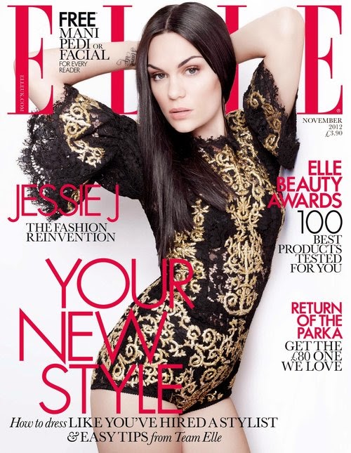
In this magazine cover Elle have used an image of Jessie J to pose for the cover, this picture is sophisticated and classy as she is not showing too much skin and she is wearing a dress in the colours black and gold which connote expensive. This image is also sexy and in some ways provocative because you can see the tops of her legs and her bum from the side this will make people interested because they will want to look like her as many people find her attractive. She is looking directly at us which makes us feel more drawn into this magazine because there is eye contact. You can tell this magazine is expensive because she looks very classy because of her hair and makeup. The masthead and cover lines are very simple and in clear lettering and in two simple colours black and bright pink which makes this magazine stand out because there are a few important things that having the whole page crammed with coverlines. I think that this magazine is targeted at people of the social economical scale A and B because it is £4.00 which for magazines is quite expensive because people of this social economical scale will have more money to spend so they can have adverts in Elle from more expensive brands like Chanel and Dior.
This magazine is clearly cheap because it says in big bold writing £1 with a yellow background. Other ways of telling that this magazine is cheap is because it is very crowded with different pictures, coverlines and advertising posts. Most low end magazines are very cluttered and full of images and different bright colour to try and get the audiences attention, whereas high end magazines are quite plain and sophisticated. This is the type of thing I will be doing for my own low end magazine cover because this is the type of look most low end magazine covers are. People lower down on the social economical scale might buy this magazine because its more in their price range, this is why there is an advert saying 25% off because if they don't have a lot of money then it would be pointless advertising very expensive items in the magazine because they wouldn't usually buy them anyway. I think this magazine is targeted at younger females because of the bright pinks and because the models are female.
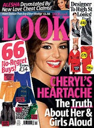
You can tell that this magazine is cheaper than Elle and vogue magazines because generally most low end magazines are always quite cluttered and do not look as minimalist and classy as higher end magazines. There are also little advertisements saying 'designer to high st looks!' which shows that people who buy this magazine probably wont be able to afford designer clothes so there would be no point in advertising those designer brands in this magazine as no one would buy them. I would say that this magazine is targeted at people in the category's of D and E on the social economical scale. I would also say that this magazine is targeted at females of 15-20 because if you attend school or college then you are a lot more likely to be unemployed or get payed very little so buying expensive magazines is out of the question. I believe that this magazine is targeted at females because of the pink masthead and main cover line, also because all the clothes advertised on this cover are women clothes consisting of dresses and skirts ect. The main image on this magazine cover is Cheryl Cole/ Fernandez Versini,this image instantly attracts the audience because she is looking straight into your eyes, most low end magazines have their main images very close up so that you can only see there face and shoulders (mid shot) with lots of other cover lines and advertisements clutter around this.
This is a positive representation of Prince Harry as he is showing that even though he is from the upper class status he is still doing something good and he cares about others as he is calling for 'support for Paralympic-style games'. Not only does this give a good image of Prince Harry it also gives a good representation of the whole royal family and upper class people in general because he is shown doing good things for other people. I i think that the picture they have used for this report is positive as he is smiling while he doing a good deed which shows that he actually wants to do it and is enjoying it.
TV Show - Gender
In this scene where Sam and Bianca are arguing and fighting it shows Londoners in a bad light as their are always arguments and fights going on in the square. So people that live further away from London might think that this is generally why happens everywhere in London. This is both stereotypical and non stereotypical because it is usually males who have fights because women are stereotyped as more calm, maternal, sophisticated so they wouldn't fight as it it shown as more f ma male thing. Phil, a big strong man, splits them up which is stereotypical of what would usually happen. Bianca and Sam are also middle aged which is not stereotypical of the age that people would usually fight as because they should of grown up and be able to hold their anger back by now, so this is going against the normal stereotypes.
Age - Film
Hot Fuzz goes against stereotypes because it shows the elderly fighting and running around with guns which usually would be very unlikely to happen, so this film provides escapism as we go into a world where anything can happen. You would usually think of teenagers and people in their 20's or thereabouts which would usually be related to fighting and crime but i this film its the opposite. In Hot Fuzz there are also elderly women fighting and using guns which goes against all stereotypes because it is usually seen as women being weaker especially when they are older however in this film there are very strong and able to take care of themselves instead of being a damsel in distress.
Race - TV Show
In this TV programme, The Big Bang Theory, Raj is seen as the token asian so that it isn't just an all white cast. He creates humour in this programme by using off colour humour to make fun of his accent and way of life. He is not a stereotypical asian as he does not keep to his religion and culture as he drinks a lot of alcohol and tries to seduce women he also eats all types of meats whenever he wants. He contrasts well with the other characters because if he wasn't there they would all be similar and there wouldn't be as many jokes made.
This magazine is targeted at woman of a higher class, in social economical groups of A and B because it is quite expensive and uses popular models for there main image for example David Beckham which is extremely popular with women. I think this magazine is targeted at women of the age 20-30 because at this point people in this age range are more likely to have jobs and therefore would be able to afford this type of magazine and the clothes, shoes, accessories ect that are advertised in this magazine. It is clearly targeted at a female audience because women are generally attracted to David Beckham and because there are cover lines saying "summer shopping", "swimsuits" and "sandals". You can also clearly tell that this magazine is targeted at a higher class because the cover of this magazine is very simple and classy which is what you find with a lot of magazines like this for example vogue, the masthead it very bold and striking and recognisable to a lot of people although its done very subtly. The coverlines relate to the audience because women over the age of 20 who have good jobs are extremely likely to buy expensive clothes and shoes to make themselves look good and these are the types of things that are advertised on the front of this magazine cover.
In Charli XCX - break the rules video she wears very little clothing, i think this is because she is singing about breaking rules and behaving badly which is what she is doing in the video. She attracts a lot of attention because she is heavily made up and has her body out an example of this is when she walks into the shop and the old man at the desk stares at her inappropriately.
This video is very fast paced and each camera angle or shot only lasts for a couple of seconds this is to make it feel like a more fast, upbeat part song that you would generally dance to. There is a few low angle shots, this makes us feel that she is very important and she is in control and a powerful woman because we are looking up to her. There is also a few closeup shots of her face with a big smile showing how she is happy and enjoying herself. When the girls walk into the party there was a crane shot moving from the floor all the way to their heads, this is to show how they are in power. There are a lot of extreme long shots in this music video to show all the surroundings and the action and to show the audience what is going on and give more of an atmosphere. The party and school bus with graffiti written on it gives more of a meaning to the words because she is dancing on top of the school bus showing that she owns the place and she doesn't care about breaking the rules and doing her own thing.
All the sound in the music video is non-digetic because it is put in afterwards. Although we are made to feel like the people in this video can hear it and they are dancing and partying along with the music although they actually can't hear anything.
The parts that are filmed outside like at the start of the clip and when she is dancing on top of the bus all have natural lighting to make it seem more realistic and relatable, however in the party bits on the video the lighting is quite dark and they have probably used artificial lighting to do this. It also looks like they have used a subtle spotlight on Charli XCX to show that she is the main person in this video and our eyes should be on her because of the extra lighting it allows us to be able to see her facial expressions which is always very happy.
Secrets and lies
Secrets and lies episode 1
At the start of this episode we see a man clearly in danger as he is running away from something or someone, it is quite dark as it looks late at night i think they have filmed it at this time so that it has a more dark and gloomy feel. As he runs past a sign for the place he is going it tops and zooms into the sign, this must mean it is relevant to the programme, it is called 'blackwood cres.' They might have used the word 'black' to foreshadow the dark gloomy events that might happen later in the programme. We next find out that a child has dies and the man we see running is going home to get a phone and get help.
There are close ups of the mans face to show his pain and distress to show the audience that something is wrong. There are lots of long shots, this is to show the surroundings as well as the man, this creates more tension and sets the scene, it makes us feel more included and involved in the story.
There is lots of non-digetic sounds such as the constant music in the background, this creates tension because the music is very fast paced. There is also some digetic sound such as the man screaming 'help' and when he comes into the house.
Jake Quickenden is represented positively as he is shown as a likeable person as he has his girlfriend/friends/family with him all showing their support and crying because of how emotional they are about his singing. They have also shown that he is attractive and also other people think that he is attractive which is something else positive about him and ore people will want to watch him for that reason. He is also represented as being quite popular and cool because of how he is dressed and his piercings which also links into him targeting his music at younger people because he is singing new music which young people are more likely to listen to. There are also quite a few close ups of his face showing how much this means to him and he is taking it seriously which makes us as an audience like him even more.


 Hot Fuzz goes against stereotypes because it shows the elderly fighting and running around with guns which usually would be very unlikely to happen, so this film provides escapism as we go into a world where anything can happen. You would usually think of teenagers and people in their 20's or thereabouts which would usually be related to fighting and crime but i this film its the opposite. In Hot Fuzz there are also elderly women fighting and using guns which goes against all stereotypes because it is usually seen as women being weaker especially when they are older however in this film there are very strong and able to take care of themselves instead of being a damsel in distress.
