This magazine is targeted at people who have a good job with a fair bit of money to spend as this magazine is quite expensive. It is a high end magazine and you can tell this because they have used a popular, well-known actress to model for the front of this cover. They have used autumnal colours like dark oranges and purples to advertise their "must-have fall looks". The main cover lines are bigger and in a different colour for example "Emma Watson" this is to grab the audiences attention to tell them straight off what will be in this magazine. The other cover lines are in a simple black font because it is still important, this is why it is on the front cover, however it isn't as popular as the main cover lines. Emma Watson is looking straight at us because if the model is looking at you while you are walking past a magazine stand it is much more likely to grab your attention. Everything on this front cover of vogue is very simple but well thought out and structured which is why this visually looks like a high class magazine and why so many people pay a lot of money for this specific magazine. The masthead of this magazine is recognisable to a lot of people around the globe, it is very simple although it is bold and eye catching. This magazine is very classy, most cheap magazines get their money by showing girls wearing very little however on this front cover she looks very classy and elegant which is why this magazine is targeted to people higher up on the social economical scale like the A and B category. Vogue includes free samples of beauty, hair or skin products from expensive brands, clothing and beauty advertisements from brands like Chanel, Versace and Dior; this why it targeted at people with more money because then they are more likely to buy the things in this magazine whereas if this magazine was targeted at people from D'sand E's they may not be able to afford anything that is advertised in this magazine.

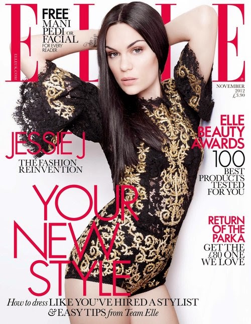
In this magazine cover Elle have used an image of Jessie J to pose for the cover, this picture is sophisticated and classy as she is not showing too much skin and she is wearing a dress in the colours black and gold which connote expensive. This image is also sexy and in some ways provocative because you can see the tops of her legs and her bum from the side this will make people interested because they will want to look like her as many people find her attractive. She is looking directly at us which makes us feel more drawn into this magazine because there is eye contact. You can tell this magazine is expensive because she looks very classy because of her hair and makeup. The masthead and cover lines are very simple and in clear lettering and in two simple colours black and bright pink which makes this magazine stand out because there are a few important things that having the whole page crammed with coverlines. I think that this magazine is targeted at people of the social economical scale A and B because it is £4.00 which for magazines is quite expensive because people of this social economical scale will have more money to spend so they can have adverts in Elle from more expensive brands like Chanel and Dior.

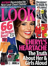
This magazine is clearly cheap because it says in big bold writing £1 with a yellow background. Other ways of telling that this magazine is cheap is because it is very crowded with different pictures, coverlines and advertising posts. Most low end magazines are very cluttered and full of images and different bright colour to try and get the audiences attention, whereas high end magazines are quite plain and sophisticated. This is the type of thing I will be doing for my own low end magazine cover because this is the type of look most low end magazine covers are. People lower down on the social economical scale might buy this magazine because its more in their price range, this is why there is an advert saying 25% off because if they don't have a lot of money then it would be pointless advertising very expensive items in the magazine because they wouldn't usually buy them anyway. I think this magazine is targeted at younger females because of the bright pinks and because the models are female.

You can tell that this magazine is cheaper than Elle and vogue magazines because generally most low end magazines are always quite cluttered and do not look as minimalist and classy as higher end magazines. There are also little advertisements saying 'designer to high st looks!' which shows that people who buy this magazine probably wont be able to afford designer clothes so there would be no point in advertising those designer brands in this magazine as no one would buy them. I would say that this magazine is targeted at people in the category's of D and E on the social economical scale. I would also say that this magazine is targeted at females of 15-20 because if you attend school or college then you are a lot more likely to be unemployed or get payed very little so buying expensive magazines is out of the question. I believe that this magazine is targeted at females because of the pink masthead and main cover line, also because all the clothes advertised on this cover are women clothes consisting of dresses and skirts ect. The main image on this magazine cover is Cheryl Cole/ Fernandez Versini,this image instantly attracts the audience because she is looking straight into your eyes, most low end magazines have their main images very close up so that you can only see there face and shoulders (mid shot) with lots of other cover lines and advertisements clutter around this.


No comments:
Post a Comment